Layout
In this section, we will learn how to position elements next to each other to create more varied layouts.
Preparation
We will now return to the other HTML document we created a while ago and complete it. This page will contain information relating to the law tunnel.
Before we proceed, we have to take care of a few things. Open law-tunnel.html in a text editor and wrap the <h1> with a div with the 'page' class.
pages/law-tunnel.html
Download these images relating to the Law and place them inside the images folder alongside beacon.jpg. Then add the following markup underneath the <h1> which links station.jpg wrapped in a new class called 'side-image'.
pages/law-tunnel.html
Add the following CSS rule to style.css. This is for images that are to be floated to the side, so we'll give them a margin of 15 pixels on the top and bottom so that they are better aligned with text and we will make them take up all the space of their parent container. This should make more sense once we have gotten the floats in place.
css/style.css
Copy and paste the following paragraphs into each <p> respectively.
Paragraph 1
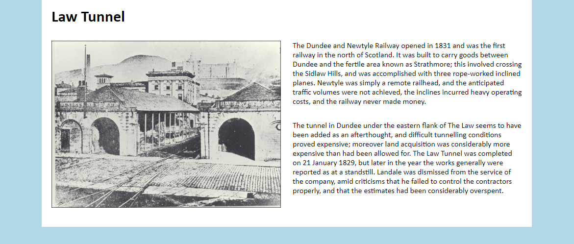
The Dundee and Newtyle Railway opened in 1831 and was the first railway in the north of Scotland. It was built to carry goods between Dundee and the fertile area known as Strathmore; this involved crossing the Sidlaw Hills, and was accomplished with three rope-worked inclined planes. Newtyle was simply a remote railhead, and the anticipated traffic volumes were not achieved, the inclines incurred heavy operating costs, and the railway never made money.
Paragraph 2
The tunnel in Dundee under the eastern flank of The Law seems to have been added as an afterthought, and difficult tunnelling conditions proved expensive; moreover land acquisition was considerably more expensive than had been allowed for. The Law Tunnel was completed on 21 January 1829, but later in the year the works generally were reported as at a standstill. Landale was dismissed from the service of the company, amid criticisms that he failed to control the contractors properly, and that the estimates had been considerably overspent.
Side-by-side elements
One way to position two elements next to each other is to float them. The following CSS rules will be required in order to do this. Type the following into style.css.
css/style.css
Floats
Floating elements left and right allow us to create simple page layouts, but there can be some side effects. If an element contains two floated elements, then its height will collapse to 0, causing other elements below to potentially shift underneath the floated elements. We use the 'group' class to fix this, also known as a clearfix. When this class is placed on the parent element, it prevents its height from collapsing.
Wrap the <div> surrounding our image with another <div> containing the class 'float-left'.
pages/law-tunnel.html
Now wrap the paragraphs with a <div> containing the class 'float-right'.
pages/law-tunnel.html
Finally, wrap both 'float-left' and 'float-right' with another <div> containing the class 'group'.
pages/law-tunnel.html
Open or refresh law-tunnel.html in the browser. You should see something like the following if you are successful.
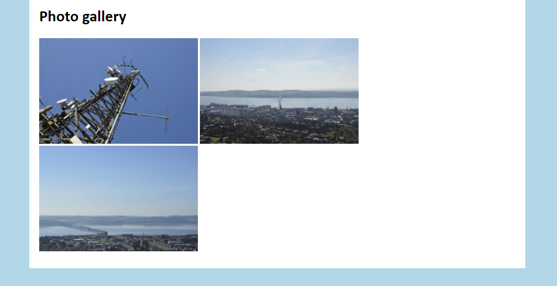
Making an image gallery
Now we will make a new page that contains a simple image gallery.
Go into the pages folder and duplicate law-tunnel.html. Name the duplicate law-photos.html and open it in your text editor. Remove all markup between the <div> with the 'page' class except for the <h1>, which we will rename 'Photo gallery'. You should end up with the following.
pages/law-photos.html
Below the heading and inside the div, add the following <div> with the class 'gallery'. This class will contain three images in a row.
pages/law-photos.html
Inside this <div>, add the following images. Note that each one is contained within another <div> with a class called 'gallery-image'. Images inside this class will be a third the width of their parent container, which is necessary if we are to fit three images in a row.
pages/law-photos.html
Add the following CSS rules to style.css. The first will add some space around the top and bottom of the gallery to push it away from other content. The second will set each 'gallery-image' to display as inline blocks. This will place each of them beside each other. Setting vertical align to 'top' means each element will sit against the top of their parent. For more information, see this CSS-Tricks article.
Block and inline elements
Elements tend to be either block or inline by default. For an element to be inline block, you'll have to declare it as such through CSS.
Block
Block elements start on a new line and take up the horizontal width of the page. Margin and padding can be added to all sides of block elements. <div> and <p> are examples of block elements.
These elements tend to appear over and under each other, such as the paragraphs you are reading now.
Inline
Inline elements appear on the same line as content around it. Margin and padding can only be added to the left and right of inline elements. <span>, <strong>, and <img> are examples of inline elements.
Inline block
Inline block elements are like inline elements, but they can have margin and padding added to all sides like block elements. This is useful for creating horizontal navigation menus, among other things.
The last rule simply sets the image to take up the full width of 'gallery-image'.
css/style.css
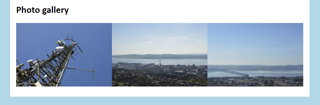
However, if you open law-photos.html in the browser, you may notice that the images don't properly fit on one line. The reason for this is a strange one with an equally strange fix.
If you look at the markup above with the three <div> elements, you'll notice that there is space between them. Because of this, the browser will place a 4 pixel gap between each one. This results in a cumulative width of 33.3% + 4px + 33.3% + 4px + 33.3%, which means the last 'gallery-image' cannot fit and is forced out below.
Gaps between each picture as a result of spaces between closing and opening tags in the markup.
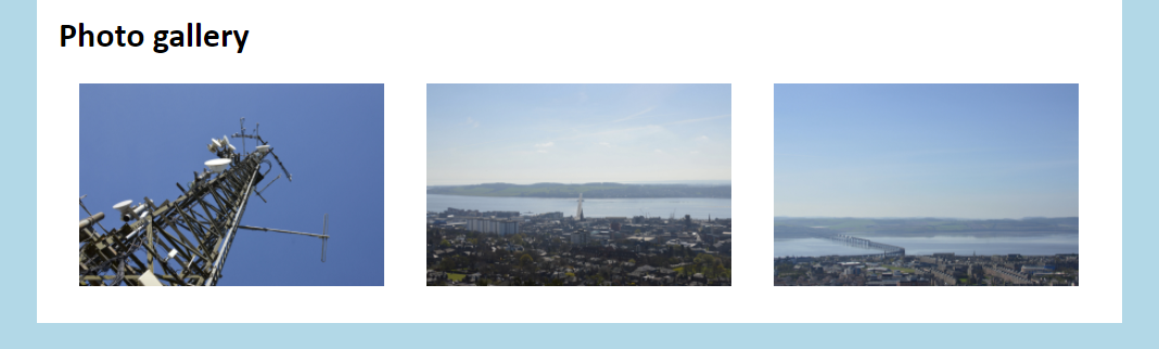
To fix this, we just have to remove the space between each 'gallery-image'. Modify the markup to look like the following, with the opening <div> tag directly following the previous closing </div> tag.
pages/law-photos.html
When you refresh law-photos.html in the browser, you should hopefully have the following, with each image arranged in a row.
Placing the closing and opening tags up against each other fixes the previous problem. However, there is no division between them.
This looks a bit tight with each image jammed close together. We can fix this by adding a little padding to the sides of each 'gallery-image'. Add a padding property with the values shown below to 'gallery-image'.
css/style.css
Refresh law-photos.html again. It should look a little better now. Feel free to play around with the padding value if you think the images are too spaced out.
The addition of a little padding fixes the tight arrangement.