Tables and forms
In this section, we will create a product list and order form. Download the following project files and extract them somewhere safe.
Order form website filesSome markup and CSS has been added ahead of time for page width, font family, and font size.
Tables
A table is a structure utilising rows and columns to lay out information in a clear and logical way.
Table elements
There are four main tags to be aware of when building tables.
| Tag | Description |
|---|---|
| <table> | Defines a table element on the page. |
| <tr> | Defines a single table row and contains table cells. |
| <td> | Defines a single table cell and usually contains some form of content. |
| <th> | A table cell that defines a table heading. Place these in the top-most table row to give columns headings. |
For our product listing we will construct a table four rows by three columns. The top row will contain headings to describe the contents of each column. We'll start by adding a heading and an empty table underneath the <h1> element.
index.html
Then, place the first table row below inside the above <table> element. This contains some table headings that describe the contents of each column.
index.html
The following is a blank table row containing three cells. Add three of these rows below the first inside the <table> element.
index.html
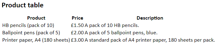
Add the information in the following lists to their respective row.
Row 1
- HB pencils (pack of 10)
- £1.50
- A pack of 10 HB pencils.
Row 2
- Ballpoint pens (pack of 5)
- £2.00
- A pack of 5 ballpoint pens, blue.
Row 3
- Printer paper, A4 (180 sheets)
- £3.00
- A standard pack of A4 printer paper, 180 sheets per pack.
You should end up with the following table. Check to make sure you've done it correctly against the following markup.
index.html
This doesn't look very good right now, but we can add some simple styling to improve it. Add the following to 'style.css'.
css/style.css
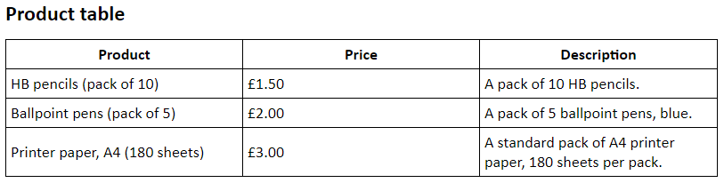
Refresh the page to see how it looks now. The table should have a black border around each cell, and each column should be of equal width with a little padding to prevent table content from getting too crowded.
To see what border collapse does, try removing it and refreshing the page. Without it, the table will have space between each cell, which is not always a desired look.
At this point, you might try adding some additional styling to the table. Consider the following list of options.
- Thick outer border
- Heading text alignment
- Headings with black background and white text
Forms
Forms are a common sight on the internet. They can be used to send messages, select options, and create content, among other possibilities. We will create a form here to allow one to order products from the above table.
Form elements
The <input> form element
This versatile form element allows the user to input a variety of data into a form. There are many options for what type of data they can be set to accept. Some common types are detailed in the following list.
| Input type | Description |
|---|---|
| text | Accepts alphanumeric input. Useful for names, addresses, phones numbers and other textual content. |
| number | Accepts numeric input. Useful for quantities. |
| Accepts a valid email address. Includes rudimentary validation in that an '@' symbol is required. | |
| radio | Allows the selection of one option from many. |
| checkbox | Allows the selection of any or all options from many. |
| button | Defines a generic button. Generally useless without the inclusion of custom JavaScript. |
| submit | Defines a button that submits a form. |
Other form elements
There are other elements aside from <input> that can be used in a form.
| Form element | Description |
|---|---|
| Select/Option | Defines a dropdown list. |
| Textarea | Similar to a text type input, but is aimed at larger bodies of text. |
| Label | A descriptive label to accompany form elements. |
| Fieldset | Groups related form elements together. |
Underneath the table, add the following markup.
index.html
Here we have three inputs, one for a customer's name, their phone number, and a contact email. We will be applying some classes to these inputs for styling purposes later. A label is placed before each input to describe what data needs to be inputted.
You may also notice that we name each inputs using the 'name' attribute. Only named form elements will be submitted upon clicking the submit button, and while we won't actually be making this form submit any data, it is a good to get used to the habit of adding a name. Additionally, some elements require a 'value' attribute. The contents of the 'value' attribute is submitted by the form which is necessary for self-closing tags like <input> tags.
index.html
The <select> tag defines a dropdown list and the <option> tags define the items presented to the user when they click on the dropdown. We only have to name the <select> in this case, but we do need to specify the value of each option using the 'value' attribute, which allows us to define simpler values than what is contained within the tag itself.
index.html
We can also set a lower and upper limit on number types by using the 'min' and 'max' attributes.
index.html
To make sure radio type inputs work correctly, be sure to give each radio in a set the same name. A value is also required.
The radio is surrounded by a <fieldset> to separate it from other form elements. The <legend> tag allows us to give it a name.
The <br> tag defines a line break, causing any following content to start on the next line. We use it here to push the second radio on to a new line. Be careful not to misuse <br> as a layout device, otherwise things can get messy.
index.html
This part is much like the previous section, except this time we have checkboxes rather than radio inputs. Since each checkbox may or may not be selected, we have to give each one a different name.
index.html
You can set the height and width of a <textarea> using the 'rows' and 'cols' attributes, but this can also be done using CSS. Because of this, we won't be adding these attributes. Another thing to take note of is that the <textarea> has a little triangle in the bottom right which allows the user to resize the box.
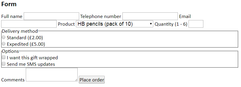
With all those elements in place, you should have some like the following on your web page.
This looks quite messy, but we can do a lot to make it look better using a little CSS. Add the following to 'style.css'.
css/style.css
This simple rule sets <label> elements, which are inline by default, to be block elements. Anything following them is therefore placed on a new line.
css/style.css
These rules make each form element take up all the width of the form. Several elements are given some padding to give their content space and a margin is applied to push elements apart. Finally, we set a minimum height for the <textarea>, so users can resize it to be bigger but it can't be shrunk less than the minimum.
Width and height can also have maximum values set. See if you can add a min and max width of 100% to the <textarea>. By doing this, the user will be able to expand it vertically but not horizontally, which can be a desirable feature.
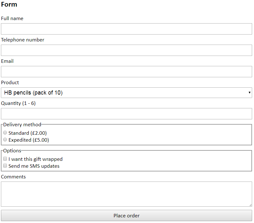
With the styling in place, you should now have something that looks like the following.
Going further
We now have a form that looks fairly neat and tidy. However, there is more you can do to make it look more interesting. Look at the following list and consider applying your own modifications based on the suggestions. Some research may be required.
- Styling a button
- Adding (or removing) borders
- Applying round corners
- Applying web fonts (look up google fonts)
- Splitting the form into two adjacent boxes